44
Lecture 6 - Correlation
The first inferential statistic we will focus on is correlation. As noted in the text, correlation is
used to test the degree of association between variables. All of the inferential statistics
commands in SPSS are accessed from the Analyze menu. Let’s open SPSS and replicate the
correlation between height and weight presented in the text.
Open HeightWeight.sav. Take a moment to review the data file.
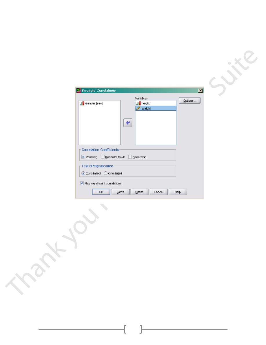
Under Analyze, select Correlate/Bivariate. Bivariate means we are examining the simple
association between 2 variables
Figure 1
In the dialog box, select height and weight for Variables. Select Pearson for Correlation
Coefficients since the data are continuous. The default for Tests of Significance is Two-
tailed. You could change it to One-tailed if you have a directional hypothesis. Selecting Flag
significant correlations means that the significant correlations will be noted in the output
by asterisks. This is a nice feature. Then click Options.
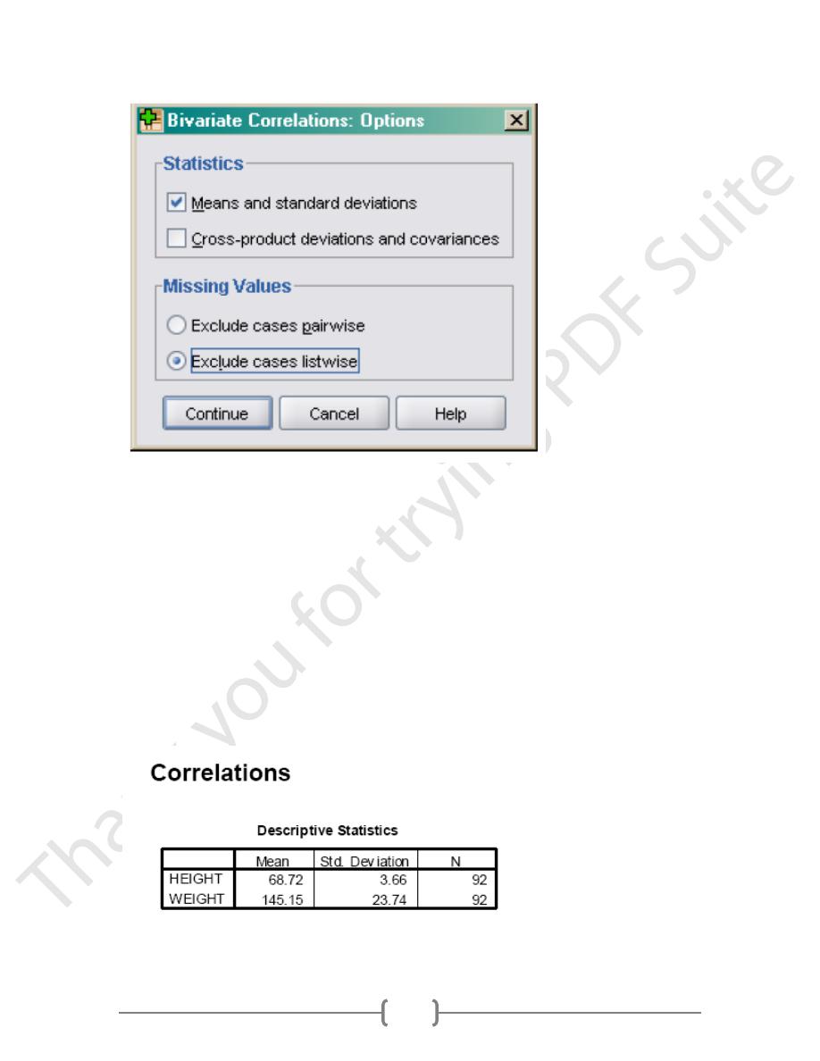
Now you can see how descriptive statistics are built into other menus. Select Means and
standard deviations under Statistics. Missing Values are important. In large data sets,
pieces of data are often missing for some variables.(Figure 2)
45
Figure 2
For example I may run correlations between height, weight, and blood pressure. One
subject may be missing blood pressure data. If I check Exclude cases listwise, SPSS will not
include that person’s data in the correlation between height and weight, even though those
data are not missing. If I check Exclude cases pairwise, SPSS will include that person’s data
to calculate any correlations that do not involved blood pressure. In this case, the person’s
data would still be reflected in the correlation between height and weight. You have to
decide whether or not you want to exclude cases that are missing any data from all
analyses. (Normally it is much safer to go with listwise deletion, even though it will reduce
your sample size.) In this case, it doesn’t matter because there are no missing data. Click
Continue. When you return to the previous dialog box, click Ok. The output follow.
46
Now you can see how descriptive statistics are built into other menus. Select Means and
standard deviations under Statistics. Missing Values are important. In large data sets,
pieces of data are often missing for some variables.
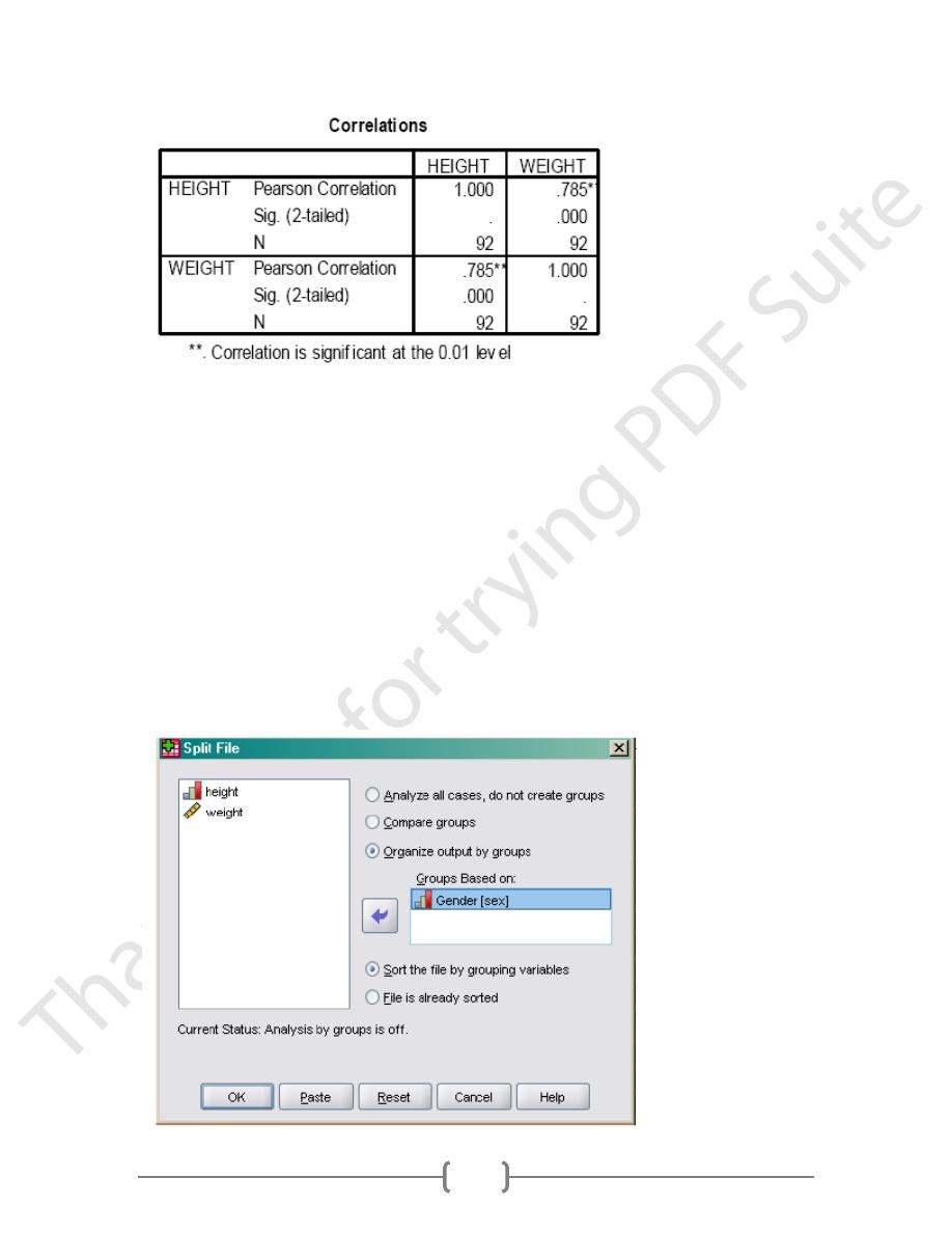
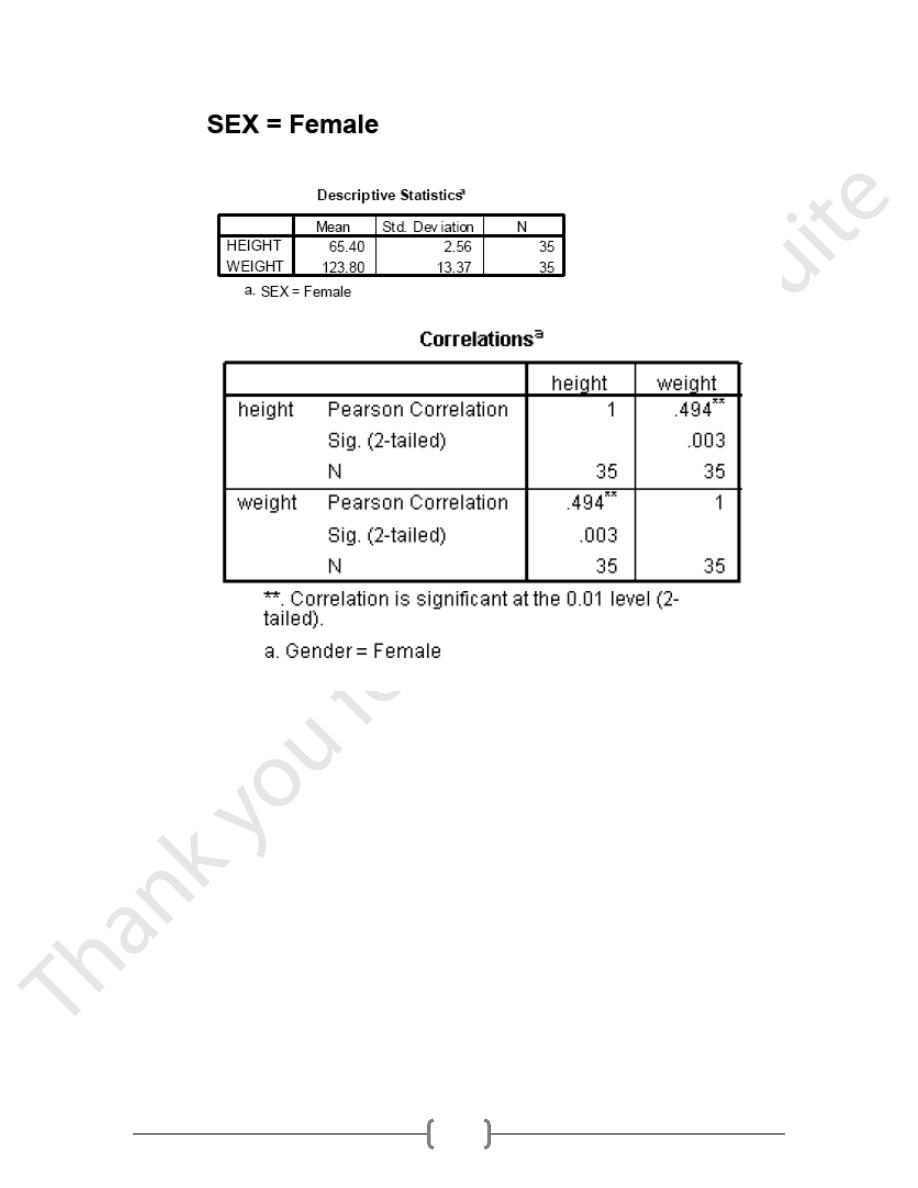
Notice, the correlation coefficient is .785 and is statistically significant, just as reported in the
text. In the text, Howell made the point that heterogeneous samples affect correlation
coefficients. In this example, we included both males and females. Let’s examine the
correlation separately for males and females as was done in the text.
Subgroup Correlations
We need to get SPSS to calculate the correlation between height and weight separately for
males and females. The easiest way to do this is to split our data file by sex. Let’s try this
together.
In the Data Editor window, select Data/Split file.
Figure(3)
47
Select Organize output by groups and Groups Based on Gender. This means that any
analyses you specify will be run separately for males and females. Then, click Ok.
Notice that the order of the data file has been changed. It is now sorted by Gender, with
males at the top of the file.
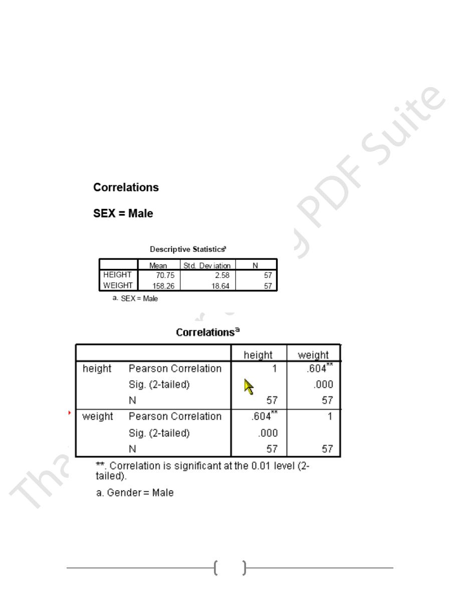
Now, select Analyze/Correlation/Bivariate. The same variables and options you selected
last time are still in the dialog box. Take a moment to check to see for yourself. Then, click
Ok. The output follow broken down by males and females.
48
As before, our results replicate those in the text. The correlation between height and weight is
stronger for males than females. Now let’s see if we can create a more complicated
scatterplot that illustrates the pattern of correlation for males and females on one graph. First,
we need to turn off split file.
Select Data/Split file from the Data Editor window. Then select Analyze all cases, do not
compare groups and click Ok. Now, we can proceed.
Scatterplots of Data by Subgroups
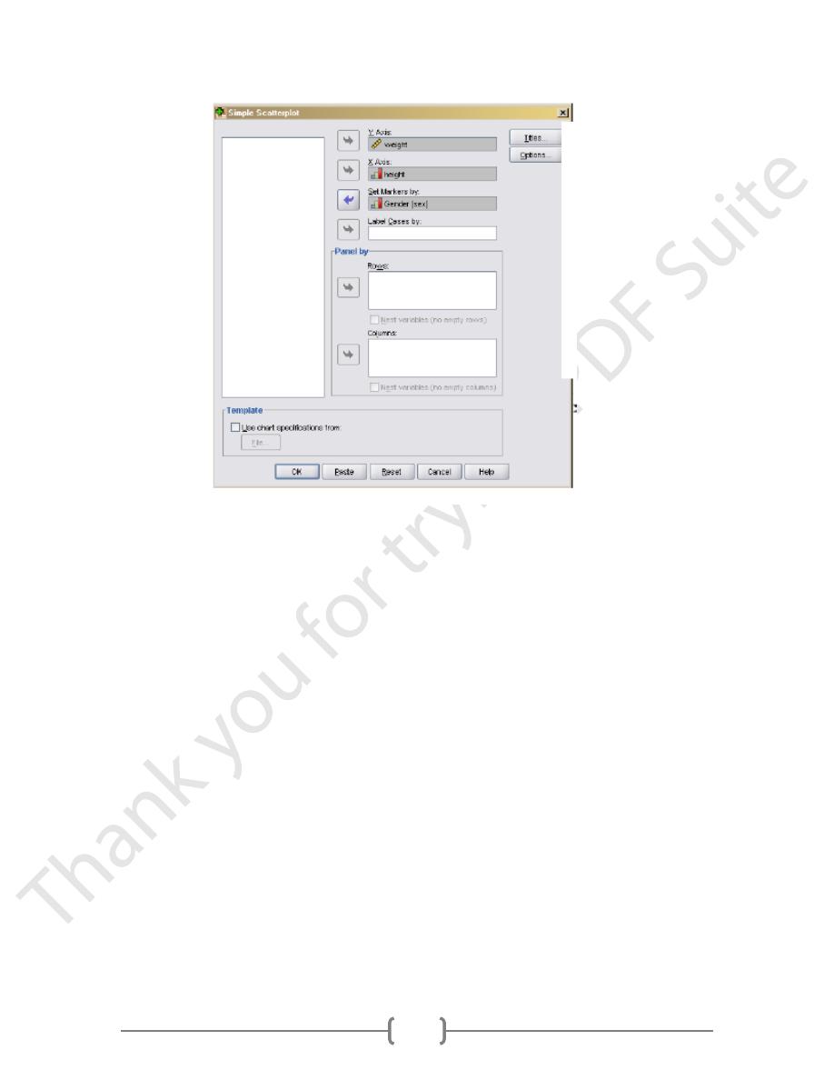
Select Graphs/Legacy/Scatter. Then, select Simple and click
To be consistent with the graph in the text book, select weight as the Y Axis and height as
the X Axis. Then, select sex for Set Markers by. This means SPSS will distinguish the males
dots from the female dots on the graph. Then, click Ok. (Figure 4)
49
Figure 4.
To be consistent with the graph in the text book, select weight as the Y Axis and height as
the X Axis. Then, select sex for Set Markers by. This means SPSS will distinguish the
males dots from the female dots on the graph. Then, click Ok.
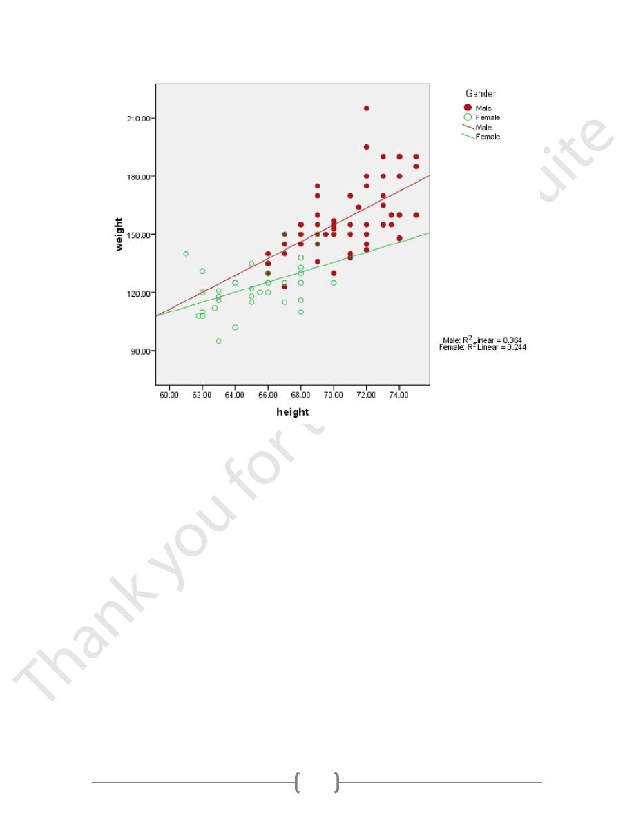
When your graph appears, you will see that the only way males and females are distinct from
one another is by color. This distinction may not show up well, so let’s edit the graph.
Double click the graph to activate the Chart Editor. Then double click on one of the female
dots on the plot. SPSS will highlight them. (I often have trouble with this. If it selects all the
points, click again on a female one. That should do it.) Then click the Marker menu.
Select the circle under Marker Type and chose a Fill color. Then click Apply. Then click on
the male dots, and select the open circle in Marker Type and click Apply. Then, close the
dialog box. The resulting graph should look just like the one in the textbook.
Click on Chart/Options.
Under Elements, select Fit Line at Subgroups. Then select Linear and click Continue. (I
had to select something else and then go back to Linear to highlight the Apply button.) The
resulting graph follows. I think it looks pretty good (Figure 5).
50
Figure 5.